Saturday, August 29, 2009

Typography Homework 8/31

01- absolute measurement: measurements for fixed values. For example, a millimeter is a precisely defined increment of a centimeter. Equally, points and picas, the basic typographic measurements, have fixed values.
02- relative measurement: relationships are defined by a series of relative measurements such as ems and ens.
03- point: A unit of measurement, often used to measure type size, equal to 0.013837 inch (approximately equal to 1/72").
04- pica: A unit of measurement equal to one-sixth of an inch. There are 12 points to a pica. A typographic measurement that has survived the digital revolution. 12 points = 1 pica; 6 picas = 1 inch; 72 points = 1 inch.
05- em: A unit of measure, which is the square of a face's point size. Traditionally, the width of a face's widest letter, the capital 'M.' For instance, if the 'M' is 10 points wide, an em is equal to 10 points. By Microsoft: A unit of measurement equal to the current type size. For example, an em in 12-point type is equal to 12 points. Em dash: One em wide, the em dash indicates missing material or a break in thought. Spaces may be added to both sides of the em dash.
06- en: A unit of measurement equal to half of one em. En dash: One en wide, the en dash indicates duration, "to" or "through" such as, "refer to pages 4-9." It may also be used in compound adjectives (as in post-World War 1~). A space can be added to both sides of the en dash.
07- legibility- The ease with which the reader can discern the type on the page, based on the tone of the type in relation to the background and the letterforms' shape with respect to each other. Letter spacing that is too tight impairs legibility.
08- rag: The uneven alignment of text lines. Ragged is the opposite of flush. A text block may be formatted to be evenly aligned (flush) on one side and unevenly aligned (ragged) on the other.
09- type alignments: flush left: the text of a paragraph is aligned on the left-hand side with the right-hand side ragged; flush right: In other languages that read text right-to-left, such as Arabic and Hebrew, text is commonly aligned ‘flush right’; centered: symmetrically aligned along an axis in the middle of a column; justified: where the spaces between words, and, to a lesser extent, between glyphs or letters, are stretched or compressed to make the align both the left and right ends of each line of text. A disadvantage to justified alignment is that it can sometimes have loose and tight lines while centered text is less readable because the ragged edges make it hard to track where to begin to read.
10- word spacing: the standard word space is defined as a percentage value of an em, which makes it relative to the size of the type being set.
11- rivers: typically occur in justified text blocks when the separation of the words leaves gaps of white space in several lines. A river effect is created where white space gaps align through the text.
12- indent: A temporary inward offset from the margin setting.
13- leading: The amount of vertical space between lines of type. The distance from the baseline of one line of type and the baseline of another line of type immediately above or below it; also known as line spacing and usually measured in points.
14- kerning: The adjustment of spacing between letters. The process of improving appearance and legibility by adjusting the white space between certain paired characters, such as 'Ty', 'To', or 'Ye', which are known as "kerning pairs." Manual kerning allows the desktop publisher to move letters either closer or farther apart ~o adjust and improve the space between them. Automatic kerning on the computer is done by using a kerning table (an AFM file) that contains pre defined font specific kerning pairs. Sometimes incorrectly referred to as "minus setting."
15- tracking- The overall letterspacing in text. Tracking can also be used to tighten or loosen a block of type. Some programs have automatic tracking options which can add or remove small increments of space between the characters.
16- weight: The measurement of a stroke's width. Common names for weights include demibold, light, and bold. Some typeface families have several weights, including ultra-bold and extra-light. Refers to the heaviness of the stroke for a specific font, such as Light, Regular, Book, Demi, Heavy, Black, and Extra Bold.
17- scale: increases in point size.
18- typographic variation: whether in the use of differing in typefaces, weights, and sizes, the introduction of bold, italic, or small-cap fonts, should serve to clarify visually for the reader specific kinds of emphasis and prioritization, and to establish consistent distinctions between different kinds of content.
19- orphan: A single line of a paragraph at the top of a page or column.
20- widow: A single line of a paragraph at the bottom of a page or column.

Wednesday, August 26, 2009

VISCOM Reading One

One part of the reading that stuck out to me was where it had said "Graphic design is a hybrid discipline. Diverse elements, including signs, symbols, words, and pictures, are collected and assembled into a total message. The dual nature of these graphic elements as both communicative sign and visual form provides endless fascination and potential for invention and combination." I like how graphic design was described as a message. I believe that art is an expression of something that means something to you, but graphic design is your expression that means something to everyone.

Tuesday, August 25, 2009

Josef Müller Brockmann is..

Josef-Müller-Brockmann was a graphic designer as a leading practitioner and theorist of the Swiss Style. That specific style conveys cleanliness, readability, and objectivity. Brockmann opened a studio in Zurich in 1936. Brockmann started off as an illustrator and when he turned graphic designer, he foremost used the grid system. He also experimented in photography. Müller-Brockmann's work ranged from social/civic projects such as posters for the Swiss Automobile Club and Zürich Police to commercial projects for IBM (for whom he was the design advisor in western Europe), Rosenthal, and Hermes Typewriters. He was also an influential mentor to contemporary designers, writing a number of books on graphic design and its history. His contributions to magazines such as "New Graphic Design," his design philosophies, and his ability to create design systems secure his status as a key figure in spreading the Swiss design ethic internationally. Müller-Brockman was author of the 1961 publications The Graphic Artist and his Design Problems, Grid Systems in Graphic Design where he advocates use of the grid for page structure, and the 1971 publications History of the Poster and A History of Visual Communication. A modular grid consists of six vertical columns and six horizontal modules, overlayed by grids of one, two, three, and four units.


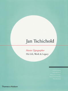
Jan Tschichold is..

Jan Tschichold started off his designing career at a very young age studying calligraphy books and typeface manuscripts. He began at the Academy for Graphic Arts in Leipzig to become a typeface designer. He visited the Bauhaus exhibition in Weimar as a Modernist. He received many design commissions.. all before he was even 20. Jan began using the serifless typeface. His work was intended to symbolize the rationalism of the modern age. The 1923 exhibition of the Bauhaus at Weimar introduced him to Modernist design, and he quickly joined the movement, rejecting traditional fonts and symmetrical composition and instead embracing sans-serif typefaces, geometric construction, and asymmetrical composition.Tschichold went on to create the Sabon typeface with three original weights. The weights were normal, italic and semi-bold until Linotype expanded it in 1984 adding a cursive semi-bold weight. Tschichold also designed transit, saskia, and zeus typefaces. Jan taught typography at Paul Renners Master Classes for Book Printers in Munich. Tschichold moved to the forefront of modern design with “elementare typographie,” a special issue of the trade journal Typographische Mitteilungen in 1925. He worked for many publishers in Basel, and as a graphic designer he had clientele from Insel Verlag publishers. He was the art director at Penguin Books while he lived in England, and oversaw the redesign of 500 paperback at Penguin Books. He later worked as a design consultant for the Basel pharmaceutical company Hoffmann-La Roche. Tschichold went on to write The New Typography: a Handbook for Modern Designers and Treasury of Alphabets and Lettering to name a few. The Van de Graaf canon used in book design to divide a page in pleasing proportions, was popularized by Jan Tschichold in his book The Form of the Book.


Typography Homework 8/25

Define the word "grid"? – A grid breaks space or time into regular units or also a pattern of regularly spaced horizontal and vertical lines. An effective grid is not a rigid formula but a flexible and resilient structure. Frutiger’s grid is a numbering system that distinguishes the width and weight of each of the Univers family’s 21 original cuts. It can be used to make the type selection a simpler process.

Why do we (designers) use a grid? What are the benefits or functions? -- The grid was designed to eliminate confusion caused by different naming systems of typefaces, as well as to make type selection simpler. The benefits are that type selection is simpler and more useful. It can be understood and used as a productive design tool within a short space of time.

What is a modular grid? – A modular grid has consistent horizontal divisions from top to bottom, in addition to vertical divisions from left to right. The modules govern the placement and cropping of pictures as well as text.

Define and illustrate: margins, columns, grid modules, flow lines, and gutter. – A margin is the edge or border of something, or the blank border on each side of the print on a page. A column is a vertical division of a page or text. A grid module is constructed of four columns and four rows to arrange text in many different ways. A gutter is the blank space or inner margin from printing area to binding.

Define: hierarchy – Hierarchy is the logical way to express the importance of different text elements through visual organization.

How are ways to achieve a clear hierarchy? – An example of achieving a clearer hierarchy would be putting the more important elements in the top right corner in a larger and bolder typeface.

Define the type family and the type styles. – A type family is a group of related typefaces that include many separate fonts. The typeface may belong to a larger type family that includes condensed and extended versions and display faces. Type styles include all the ways that a typeface can be modified. For example you can change it into bold, italics, bold italics, roman, or regular.

http://www.proximasoftware.com/fontexpert/terms/