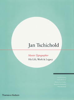
Jan Tschichold started off his designing career at a very young age studying calligraphy books and typeface manuscripts. He began at the Academy for Graphic Arts in Leipzig to become a typeface designer. He visited the Bauhaus exhibition in Weimar as a Modernist. He received many design commissions.. all before he was even 20. Jan began using the serifless typeface. His work was intended to symbolize the rationalism of the modern age. The 1923 exhibition of the Bauhaus at Weimar introduced him to Modernist design, and he quickly joined the movement, rejecting traditional fonts and symmetrical composition and instead embracing sans-serif typefaces, geometric construction, and asymmetrical composition.Tschichold went on to create the Sabon typeface with three original weights. The weights were normal, italic and semi-bold until Linotype expanded it in 1984 adding a cursive semi-bold weight. Tschichold also designed transit, saskia, and zeus typefaces. Jan taught typography at Paul Renners Master Classes for Book Printers in Munich. Tschichold moved to the forefront of modern design with “elementare typographie,” a special issue of the trade journal Typographische Mitteilungen in 1925. He worked for many publishers in Basel, and as a graphic designer he had clientele from Insel Verlag publishers. He was the art director at Penguin Books while he lived in England, and oversaw the redesign of 500 paperback at Penguin Books. He later worked as a design consultant for the Basel pharmaceutical company Hoffmann-La Roche. Tschichold went on to write The New Typography: a Handbook for Modern Designers and Treasury of Alphabets and Lettering to name a few. The Van de Graaf canon used in book design to divide a page in pleasing proportions, was popularized by Jan Tschichold in his book The Form of the Book.
Tuesday, August 25, 2009
Jan Tschichold is..
Subscribe to:
Post Comments (Atom)


No comments:
Post a Comment